matplotlibを使ってタイムテーブルを作る
23 May 2015
Language Select:
はじめに
先日、ちょっとタイムテーブルを作る用事があり、その際にmatplotlibを使ってタイムテーブルを作りました。学会やシンポジウム等でも使えるんじゃないでしょうか。
出来ること
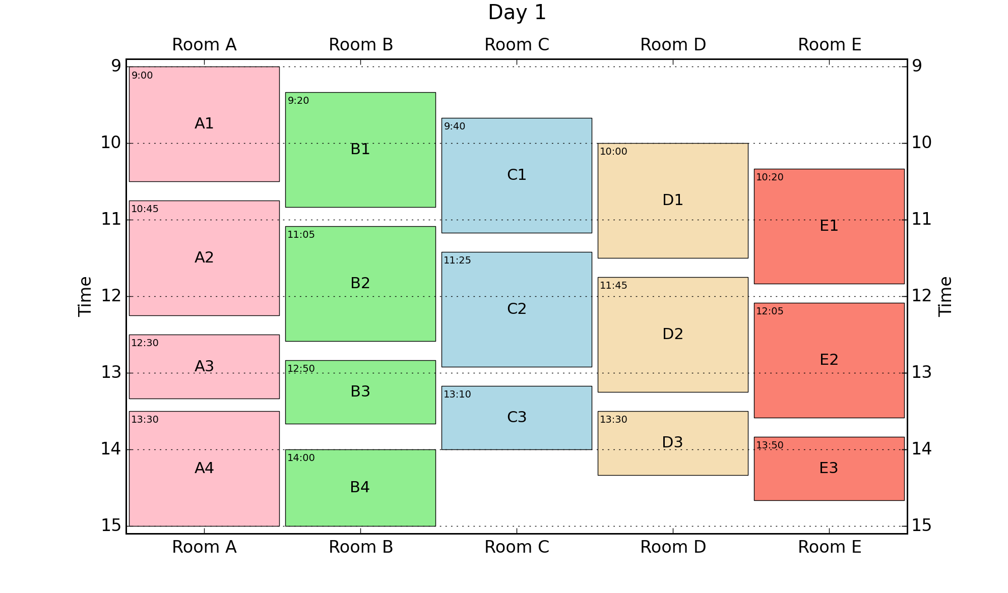
- テキストファイルから、Room名、イベント開始時刻(時間、分)、イベント長さ、イベント名を読み込む
- 部屋ごとに色分けして、イベントが塗りつぶしプロットされる
- イベントには、イベント名および開始時間が記載される
データファイル書式
以下のように作成します。左から、Room名、開始時刻(時間)、開始時刻(分)、イベント長さ、イベント名です。Room名は連続する数字で作成してください。今回の場合は1->Room A、2->Room Bです。
1	9	0	90	A1
2	9	20	90	B1
3	9	40	90	C1
4	10	0	90	D1
5	10	20	90	E1
1	10	45	90	A2
2	11	5	90	B2
3	11	25	90	C2
4	11	45	90	D2
5	12	5	90	E2
1	12	30	50	A3
2	12	50	50	B3
3	13	10	50	C3
4	13	30	50	D3
5	13	50	50	E3
1	13	30	90	A4
2 14 0 60 B4これをdata1.txtとして保存してください。
処理プログラム
Room数を増やしたければ、roomsリストに追加してください。それにともなって、colorsリストにも色を追加してください。 日にちが増えるようでしたら、input_filesリストに追加してください。あわせてday_labelsにも追加してください。
 1 #!usr/bin/env python
 2 #coding: utf-8
 3 import matplotlib.pyplot as plt
 4 rooms=['Room A','Room B', 'Room C', 'Room D', 'Room E']
 5 colors=['pink', 'lightgreen', 'lightblue', 'wheat', 'salmon']
 6
 7 input_files=['data1.txt']
 8 day_labels=['Day 1']
 9
10
11 for input_file, day_label in zip(input_files, day_labels):
12     fig=plt.figure(figsize=(10,5.89))
13     for line in open(input_file, 'r'):
14         data=line.split()
15         event=data[-1]
16         data=map(float, data[:-1])
17         room=data[0]-0.48
18         start=data[1]+data[2]/60
19         end=start+data[3]/60
20         # plot event
21         plt.fill_between([room, room+0.96], [start, start], [end,end], color=colors[int(data[0]-1)], edgecolor='k', linewidth=0.5)
22         # plot beginning time
23         plt.text(room+0.02, start+0.05 ,'{0}:{1:0>2}'.format(int(data[1]),int(data[2])), va='top', fontsize=7)
24         # plot event name
25         plt.text(room+0.48, (start+end)*0.5, event, ha='center', va='center', fontsize=11)
26
27     # Set Axis
28     ax=fig.add_subplot(111)
29     ax.yaxis.grid()
30     ax.set_xlim(0.5,len(rooms)+0.5)
31     ax.set_ylim(15.1, 8.9)
32     ax.set_xticks(range(1,len(rooms)+1))
33     ax.set_xticklabels(rooms)
34     ax.set_ylabel('Time')
35
36     # Set Second Axis
37     ax2=ax.twiny().twinx()
38     ax2.set_xlim(ax.get_xlim())
39     ax2.set_ylim(ax.get_ylim())
40     ax2.set_xticks(ax.get_xticks())
41     ax2.set_xticklabels(rooms)
42     ax2.set_ylabel('Time')
43
44
45     plt.title(day_label,y=1.07)
46     plt.savefig('{0}.png'.format(day_label), dpi=200)
出力されるタイムテーブル
上のプログラムを実行すると、以下の様な画像が出力されます。
blog comments powered by Disqus